
 I love designing for causes. There's a warm fuzzy feeling that comes along with knowing you had a hand in creating something that has an effect on people in an emotional way. For this project, I decided to brand a campaign for a social cause or movement, rather than a for-profit product. Skin cancer is one of the most common forms of cancer and also one of the most preventable. Ban The Tan is a campaign aimed at teenagers (age 14 to 18, primarily female) to encourage them to prevent skin cancer by wearing sunscreen and not tanning or burning in the sun.
I've found most campaigns aimed at teenagers try to scare them into cooperating - think anti-smoking ads showing black lungs or anti-drunk driving ads showing bloody car crashes. While that may work in those cases, they make viewers feel like they're being scolded by an adult. Hardly a way to get them involved in the cause. For my campaign, I decided to come from a more friendly standpoint using a sarcastic, "oh no you didn't" tone (think of the movies "Clueless" or "Mean Girls") in slogans and materials to bring a sense of humor to the campaign. By making the cause fun and funny, it make the audience want to join in promoting the campaign through wearing branded merchandise, spreading materials across social media, discussing advertisements with friends, and so forth.
The campaign called for two logos - one for the campaign itself and one for the parent organization that would sponsor the campaign, were it a real one, the National Comprehensive Cancer Control Program (NCCCP).
 The NCCCP logo is straight-forward, a logomark contained in a circle that echos the forms of the letters, colored in the unofficial cancer support color, lavender. While the NCCCP is an organization, I didn't want the logo to look too corporate because cancer is such an emotional issue. I aimed to strike a balance between the two sides.
 The Ban The Tan logo is much bolder to really get the message across. The stacked orientation emphasizes each individual word and gives it a punch. A color palette of bright colors in all of the rainbow was selected to use for this logo and all promotional materials.


The central component of this campaign is the advertisements. A series of 8 posters, in two sets, were created to be displayed at locations where teenagers and the outdoors meet- beaches, parks, concerts, bus stops, amusement parks, etc. There are two sets of 4, with each set taking a different viewpoint. The first set is pro-pale and features characters from popular culture (what teenager doesn't love pop culture?) that are know for being pale and are appreciated for it. The second set is ant-tan/burn, yelling out reasons why tanning should be avoided.
Each set has an aesthetic that reflects it's message- the pro-pale posters are smooth, shiny, and refreshing. The anti-tan posters are cracked, aggressive, and kind of gross. Both sets feature strong, dynamic type to get the attention of the viewer and get across how important this message is.
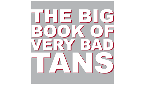 Also created was a booklet that could be handed out at events, sent in the mail as part of promotional packets, placed on counters or information booths in public areas. This booklet, "The Big Book of Very Bad Tans", is a humorous look at the ugly side of tanning - tan lines. The tan lines are given names and are illustrated with a bold red to represent burns and secondary colors taken from the color palette. The booklet finishes with informational facts about skin cancer and tips on how to avoid burning and tanning.


Stickers were also created as hand-outs. In the one below, the sticker is the logo printed on a clear sheet. Would could be a good use of such a thing? How about teaching sleeping tanners a little lesson? Not that I would ever advocate such a mean spirited thing. Never.

 Alternative sticker. Tanning bed = death bed. Gets the message across with strong imagery and muted, eerie colors.
Teenagers LOVE free stuff. They flock to it like seagulls to a french fry. Branded merchandise is one of the greatest ways to promote to a younger crowd as they don't particularly mind becoming a walking billboard.
All merchandise created for the campaign features the logo - and thus, the message- on white (for contrast) with the logo available in all the colors of the color palette. All the merchadise was chosen with purpose - shirts, light-weight sweatshirts, and umbrellas are all useful for covering up at the park or when hanging outside. Canvas totes are great for carrying belongings to the beach, which is where this message really counts. And bracelets and pins - wearable and collectible - are always a solid choice as they can go anywhere and with anything.


Missing for this post: The website and twitter. Not having a social media element in a campaign aimed at teenagers would just be silly. That's currently being work on so keep an eye out for that.


